|
A few days ago, my book cover designer sent me the cover roughs for my upcoming fourth book, I Can See Your Underwear: My Journey Through the Fitness World. It was a set of four options on the design for my cover. In less than 24 hours, we were back and forth twice more, and I had my final design. (And if you keep reading, you’ll see it for yourself.) We had actually started the process a few months ago, but I asked her to hit pause on the design. You see, I thought I was fine with the title and subtitle, but I was having second thoughts. No point having my designer go through a full round of editing if the text was liable to change! And that’s a key part of the creative process, especially when you’re a self-published author: having a catchy title that’ll will be noticed, but that also includes multiple keywords. You know, the words someone might type into a Google or Amazon search bar to find a book. In the case of my fourth book, I jumped the gun on naming it. Luckily, I realized my error before I had spent money on the cover design. Fast forward to a few weeks ago, when I unpaused the cover design, asking my designer to continue with this project. We again had a few back and forth emails, and in one she asked about font. “I trust your design expertise on the font front.” Well, that was probably the best response I could have sent, because she replied along the lines, “If you trust my design skills, can I give you feedback on the image you chose?” When planning my book covers, I browse stock photo websites and purchase images there. In this case, though, my cover designer felt the image I had chosen was of lower quality than my other cover images. Basically, it wasn’t the right look for the overall theme of my books. She then recommended I hire a graphic artist to create an image that worked with my other covers. Thus began a multi-day search for a suitable artist. I vetted half a dozen artists and settled on one who, it turns out, lives about 15 minutes away from me! I was speaking with artists from around the world, and found the most suitable one very close to home. Small world indeed… What a fun process it was to have a talented artist create the image that I would eventually use! First round saw him send me a black and white image for approval: 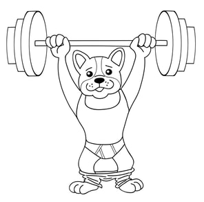 Image: Rick Enright Image: Rick Enright Next up, he filled in the colours and sent me several drafts over the course of a Saturday afternoon and evening. By the fourth draft, I was pleased with the final product and signed off on it. So that was the image I sent to my cover designer, along with a mockup of my cover—this time, with all the right words in the title and subtitle. Would you like to see the cover of my next book? Keep scrolling down this page… What do you think? Please feel free to leave a comment below.  Cover: Dianna Little, Image: Rick Enright Cover: Dianna Little, Image: Rick Enright
0 Comments
Leave a Reply. |
Categories
All
Archives
July 2024
AuthorAmanda Sterczyk is an international author, Certified Personal Trainer (ACSM), an Exercise is Medicine Canada (EIMC) Fitness Professional, and a Certified Essentrics® Instructor. |
 RSS Feed